bayard
Candidate experience

I worked with a special projects team at Bayard (known as KROW, "work backwards") to attempt to create a job application experience that was as simple as it was joyful. This required our small team to really take a step back, return to first principles, and cut away all of the most annoying and worst patterns present in the job search market.
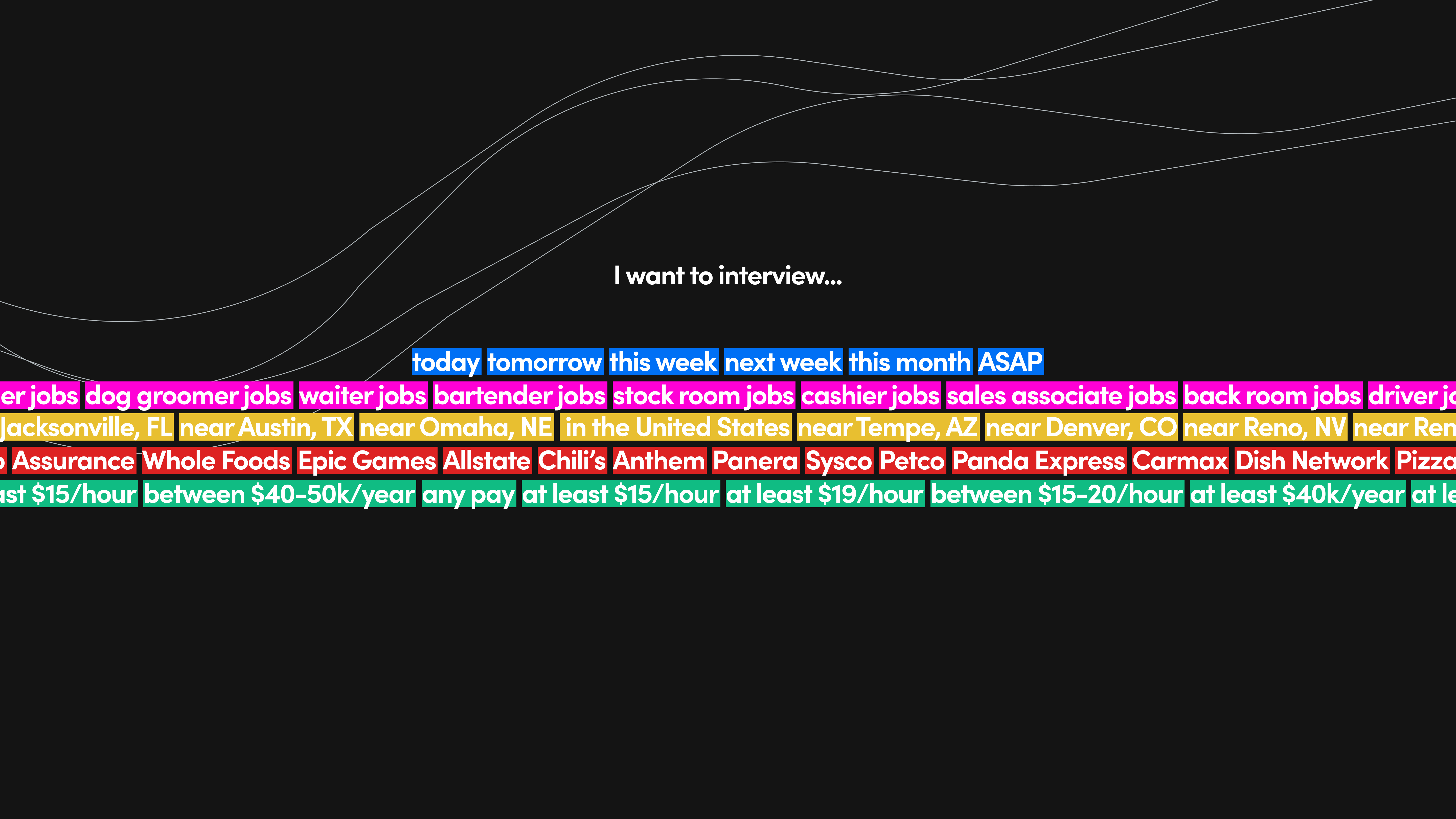
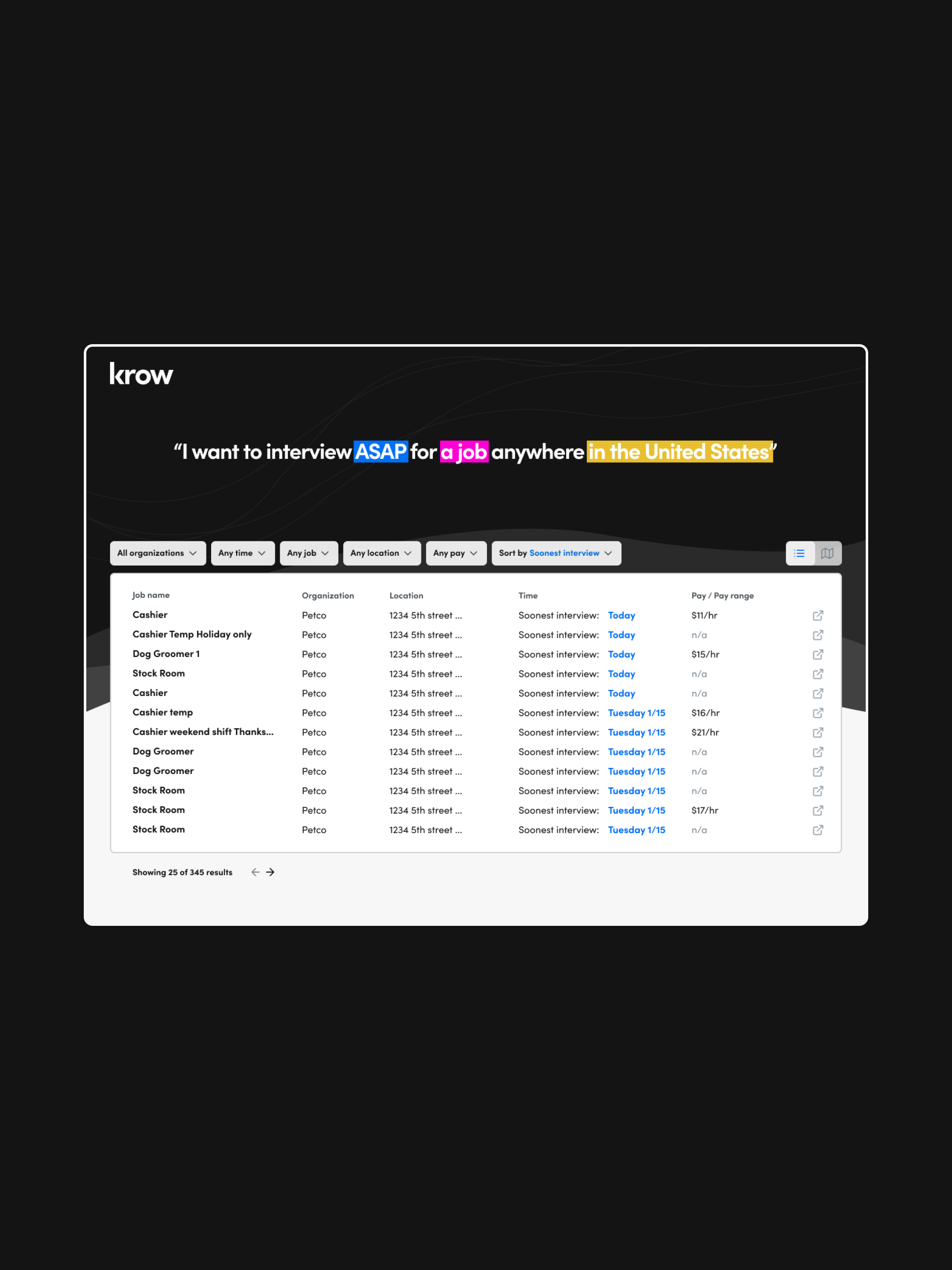
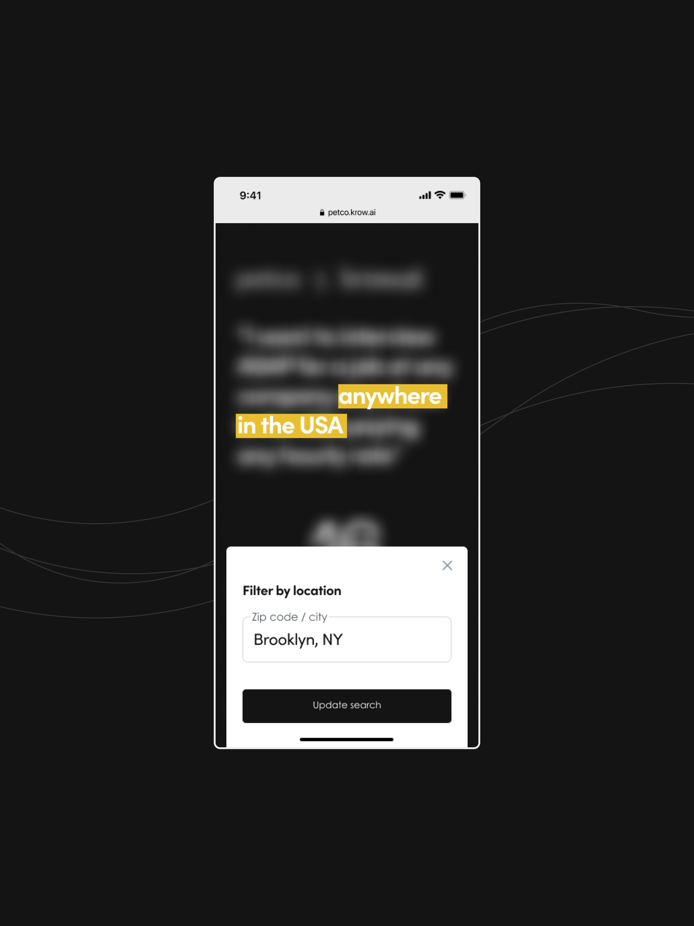
I focused on designing a simple and easy-to-recognize aesthetic that would be enjoyable to touch, feel, and view as an active job-seeker. This meant bright, simple colors, and a clear actionable route throughout the process. We worked to truly remove whatever fluff we could in an attempt to "cut to the chase" and get our users to their desired endpoint (a scheduled interview) as soon as humanly possible.
In the end, we were able to pull in that intangible human touch to an industry that continues to focus on machine interactions and AI, without sacrificing the clear advantages of a smart product. Each screen and each step of the flow contained wording meant to feel natural, color that gave clear and actionable feedback, and simple tools that flowed naturally and swiftly to the users goal.


